Healthy Milkies
A native mobile app for mothers to log feeding sessions with one hand, track twins or triplets as separate profiles, and read the pattern back as a chart rather than a list of numbers.
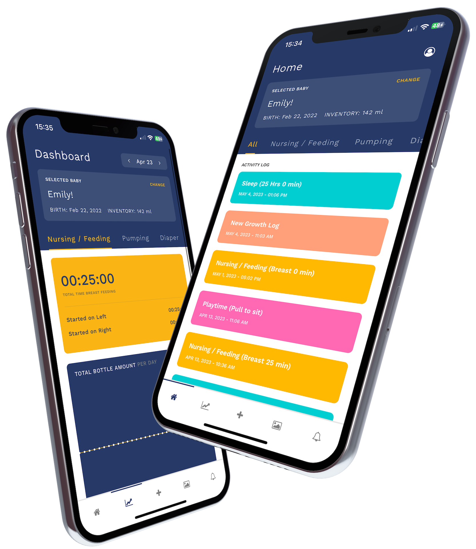
Feeding records that made sense at 3am
The first weeks with a newborn produce a volume of medical detail nobody warns you about. Which side was fed from last. How long the session ran. How many nappy changes since the previous feed. Whether today looks different from yesterday. Midwives and health visitors ask for all of it, and parents try to answer from memory.
Or from a notes app that made perfect sense at 3am and means nothing three days later. Existing feeding trackers tended to be either too clinical or too limited, and almost all of them assumed one baby.
Healthy Milkies was built for mothers who wanted to track feeding properly, and particularly for mothers of more than one infant, where the load of tracking concurrent sessions across babies becomes significant very quickly.
More than one baby as the starting point
The core design constraint was that multi-baby tracking had to be a first-class feature, not a workaround bolted onto a single-baby model. Managing twins or triplets means switching between profiles mid-session, tracking feeds that start at different times and run at the same time, and reading insights that keep each baby's pattern distinct instead of blending them.
That constraint shaped the whole interaction model. Switching context between babies had to be fast. Starting and stopping a session had to be fast. And it had to be unambiguous, at every moment, which baby the current action belongs to, because a feed logged to the wrong twin is worse than no record at all.
It also ruled out the obvious shortcut of treating a second baby as a second copy of the app. Two profiles with no shared home screen would have meant switching apps at the moment of least attention. One app, several babies, one place to see all of them together was the only model that respected how a night with newborns actually goes.
Sessions, insights and a home screen per baby
The core interaction is starting a session: choose the baby, choose the feeding type and side, start the timer. Ending the session logs the duration on its own. Every entry is timestamped, searchable by baby, and exportable as a summary for the next health visitor appointment.
The insights view surfaces patterns across a rolling window: average feed duration by time of day, frequency trends, and a comparison between babies where there is more than one. It is drawn, not tabulated. A mother should be able to glance at the chart and know whether this week looks like last week without reading a table of numbers.
For families with multiple babies, the home screen shows each baby's status, last fed and time since, at a glance. Starting a new session is one tap from there.
Why native rather than a web app
A feeding session is logged with one hand, often in the dark, often while holding the baby being fed. Opening a browser, waiting for a page, finding a form and filling it in is not something anyone does in that position. A web app was ruled out on that basis alone.
Native mobile gave the speed and the one-tap entry the situation demanded. The app opens directly to a state where starting a session is the single most prominent thing on the screen, and everything else is reachable but out of the way. Nothing stands between opening the app and the timer running. The cost was a longer build. The alternative was an app that would not be used at the exact moment it existed for.
A night and a morning with the app
A feed begins. The mother opens the app, taps the baby, taps the side, and the timer runs while she does nothing else. When the feed ends she taps once more and the session is recorded with its duration. If the second twin wakes before the first has finished, she switches profile and starts a concurrent session without losing the first.
In the morning the home screen shows who was fed when and who is due. Before a check-up she opens insights, or exports the summary, and hands over an actual record. What nobody does any more is reconstruct the last few days from memory, or from scraps of paper on the bedside table. Because each entry is tied to a baby and a timestamp, the export for the health visitor is simply the log filtered and summarised. There is nothing to compile.
What mothers use it for today
Parents log sessions in real time without interrupting the feed. The insights view gives health visitors and parents a structured picture of the feeding pattern without anyone rebuilding it from memory. Mothers managing multiple babies track each one separately, with a combined home screen that shows at a glance which baby is due next.
The record underneath, a baby, a session, a timestamp, a side, is deliberately simple, and that simplicity is what lets the app stay fast on the screen while still producing the charts and exports a clinician can use. Everything the app shows is built from that same record.
Start a project.
Book a call or send a brief. The engineers who would build it read everything.