SuperHumans
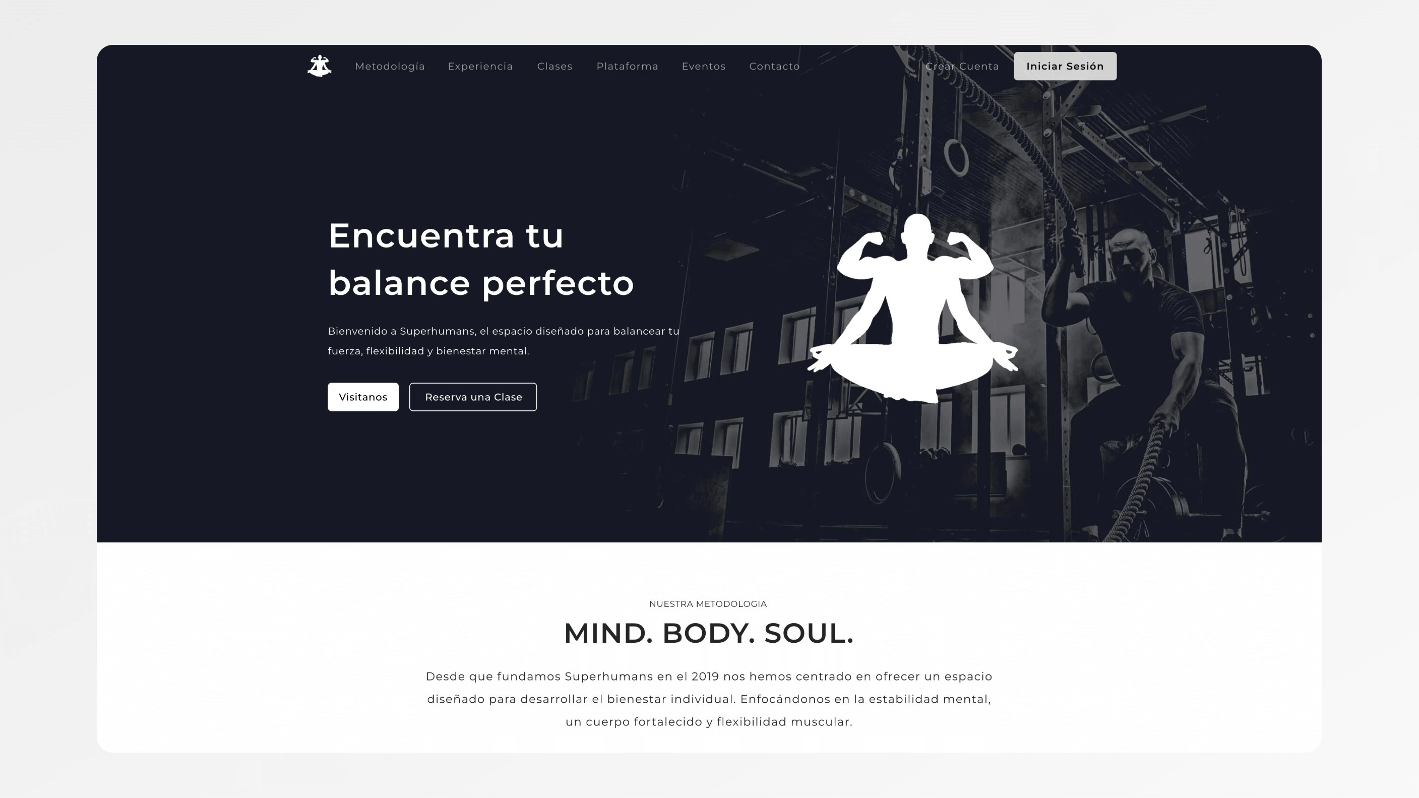
A single landing page for SuperHumans, a training gym in San Pedro, Mexico. It puts the community, the classes and the coaches in front of a visitor in the order that leads to an enquiry.
A gym that had built a community but couldn't show it online
SuperHumans is a gym with a specific identity: a training community built around performance, accountability and a group culture that sets it apart from a commercial gym. Anyone who trained there understood it within a session. Online, it was invisible. The website was a generic template with a class schedule and a contact form, indistinguishable from any other gym in the area.
The problem was measurable at the enquiry step. Prospective members arrived, found nothing that reflected the culture or made the training offer concrete, and left. The gym was growing through word of mouth, and the site was losing exactly the people word of mouth sent, at the moment they went to check.
A referral creates an expectation. The person who was told they had to try this place opens the site expecting to see why. A template cannot confirm that, and an unconfirmed expectation reads as a warning.
One page that had to do one job
The brief was not a full website. It was one page that converted visitors into enquiries, and that limit was useful. No separate pages for classes, community, trainers and pricing that a visitor has to navigate between. Everything needed to decide, visible without clicking away, in the order that leads to the decision.
The constraint that mattered most was sequence. On a single page, the order in which information appears determines whether a visitor reaches the enquiry step or leaves before it. Put pricing first and the visitor evaluates cost with no sense of value. Put the form first and nobody knows what they are enquiring about.
The second constraint was the device. Traffic from social media and referrals arrives on a phone, so the page had to be designed mobile-first, with the desktop layout as the derived version rather than the other way round.
A page structured around the training offer
The page opens with the gym's identity rather than a generic hero line: the specific training culture, what makes it different, who it is for. Class types and programme formats follow, described in terms of what the training produces rather than what it is called. Social proof, member outcomes, community content, the atmosphere of a session, comes before pricing, so the value is established before the cost is visible.
The enquiry step is a short form rather than a phone number or an email address. Three fields: name, contact details, and which class type the visitor is interested in. That last field is the important one. It routes the enquiry to the right coach instead of a shared inbox, which improved both response time and the relevance of the first reply.
The page is built mobile-first. Type, spacing and the position of the form are all decided for a phone screen first.
Why a single page over a full site
A full site, with separate pages for classes, trainers and community, gives a gym more room to tell its story. The case for it is obvious. The problem is behavioural: most visitors do not navigate between pages. They land somewhere, scroll for a few seconds, and either enquire or leave.
A single page that puts everything in front of the visitor in the right order converts cold traffic better than a multi-page site that relies on people clicking through. The story gets told in one scroll, and the form is at the end of it rather than behind a menu.
The trade-off is depth. There is less room for a long trainer biography or a full class-by-class breakdown. The full site can follow once the gym has a conversion baseline to build on; until then, more pages would mostly have been more places to lose people.
What happens when a referral lands
A prospective member taps a link from a friend's message and lands on the page on their phone. They see the culture first, then the class formats, then members who look like the people they were told about. By the time pricing appears, they know what it buys.
They fill in the form, pick the class type that interests them, and submit. The enquiry goes to the coach who runs that programme, who replies with something specific to the class rather than a generic welcome. The front desk no longer triages a shared inbox or forwards messages to find the right person.
Nothing about the follow-up conversation changed. What changed is that the right one starts sooner, with a visitor who already knows what the gym is.
What the page delivers for the business
Prospective members meet a brand presentation that reflects the gym's culture and training offer before they are asked to enquire. The form routes each enquiry to the right coach. From its base in San Pedro, Mexico, the gym now has an online presence that shows what makes it different.
That is what every word-of-mouth referral arrives expecting to see confirmed, and it is now confirmed on the first screen. The page also gives the gym something it did not have before: a baseline for how visitors convert, which is the starting point for anything built next.
Start a project.
Book a call or send a brief. The engineers who would build it read everything.